Baralan Introduces DEA, its Airless Packaging Solution in Glass

Marrying quality through functionality and sustainability, the new DEA series is the first airless system where the product is directly in contact with the glass.

Baralan, a consolidated player in primary packaging for the cosmetics and beauty industries, has introduced DEA – which stands for Developing the Evolution of Airless – a new series of products composed of glass airless containers designed for several applications. Unlike other airless systems, DEA has no internal plastic container, making it the first airless system in which the filled product is directly in contact with its glass container.
As a more sustainable solution, the DEA series represents a new philosophy of primary packaging in glass, using fewer components and significantly reducing the amount of overall materials, resulting in a lighter and more functional packaging that still offers impact to brands with a new level of user experience. In addition, its airless nature helps better preserve the integrity of the product ingredients, is suitable for different usages and is extremely versatile in application.

DEA features high-quality glass packaging that provides further aesthetic appeal. Moreover, glass is known to be notably more compatible with formulas. The DEA series is available in two versions: classic and premium, both of which allow for the possibility of single-use or refillable solutions of the glass container. A unique concept, the refillable version allows for convenient replacements of the glass container to promote the re-usability of components. The ability to also quickly and practically separate components provides new opportunities to improve product lifecycle – embracing sustainability and eco-consciousness in packaging.

DEA is available in three nominal capacities: 15ml, 30ml and 50ml. Its standard GPI 18/400 neck finish, combined with the airless system, is compatible with a vast range of pumps. This allows for increased modularity for different sets, as well as high levels of product personalization. In each version, the transparent glass allows for the filled product’s color to remain visible for an authentic appeal. However, the style of this series also provides advantages regarding customization through various decoration techniques.

The innovative DEA series has been developed through an equally innovative manufacturing process, significantly reducing energy consumption for a more sustainable approach. Another feature of this new solution is the ability to eliminate lubricant use, which is due to the unprecedented smoothness of the piston inside the glass container.

Thanks to Baralan’s dedicated teams of quality and research professionals, it has been possible to achieve such an innovation. The exploration of this new solution opens the path to new product line opportunities that provide an evolution of primary packaging in glass – and airless packaging in general – to drive and shape the future of beauty.

Gmund Hanf – Hemp paper

Only Gmund Paper can do it: 100% European hemp becomes a sensationally ecological and creative paper

After having developed a hemp paper containing up to 50% cannabis pulp from European cultivation (supplemented by virgin fiber pulp) for its Bio Cycle collection, Gmund Paper has now succeeded in producing a paper made from 100% cannabis pulp. Hemp’s long fibers, which are a challenge for paper production, make this innovative paper both strong in structure and wonderfully soft to the touch. The paper’s surface is wild and cloudy – pure nature. The collection also includes Gmund Hanf 50%, which contains recycled paper fibers, and Gmund Hanf 10%, which is made from pure pulp. Gmund Hanf is produced entirely without dyes.

Learn more about Gmund Hanf – Hemp paper.

The plant

Hemp (Cannabis) is a genus in the hemp family. Hemp numbers among the first plants utilized by humankind. The plant is popular as a renewable resource because it is problem-free to cultivate and completely usable. No herbicides are needed because the plants completely shade the ground after only a few days, so no weeds can find light. Hemp is also extremely pest resistant, requires little care and produces more biomass than any other domestic crop. Hemp is extremely versatile in its commercial applications and is appreciated for its high durability, environmental compatibility and low energy footprint.

Hemp paper

Hemp was used for making paper very early in the history of civilization. Until 1883, between 75% and 90% of the paper produced worldwide was made with hemp fibers. This was also the case with the Gutenberg Bible, for example. After the cultivation of hemp was prohibited in many countries, hemp paper disappeared from the scene. In the meantime, the cultivation of commercial hemp has been permitted again in large parts of Europe.

Advantages of hemp for paper production

  • A field of hemp yields four to five times as much paper as a forest of the same size
  • Hemp grows four meters per year
  • Hemp can be harvested three times per year; by comparison, a tree needs about seven years to grow 
  • Hemp does not deplete the soil, so it can be replanted immediately after harvesting
  • Hemp fibers are long and very stable; compared to wood pulp, hemp pulp has four to five times longer fibers, as well as higher tensile, tear and wet strengths
  • Hemp fibers are naturally very light in color and accordingly require much less bleaching
  • Hemp improves the future recycling process and can be repeatedly recycled

Learn more about Gmund Hanf – Hemp paper.

Gmund Hanf at a glance:

  • Three varieties: Gmund Hanf 100%, Gmund Hanf 50% and Gmund Hanf 10%
  • Available in grammages of 120 g/m² and 320 g/m²
  • Suitable for all common printing techniques

Click here to get to the collection.

About Gmund Paper

Since 1829, Gmund Paper has stood for paper culture and the ecological production of unique communication media from natural paper. The pulp of all Gmund papers is FSC certified. Custom-made solutions for sustainable brand presentations are created at the development and production site in Gmund am Tegernsee. Approximately 75% of the papers are exported. A family-owned company, Gmund Paper is currently managed in the fourth generation by Florian Kohler and Herbert Eibach.

CONTACT FOR JOURNALISTS:

For more information about Gmund Paper, please contact Sabine Huber, Public Relations, Tel. +49 8022 7500-73, shuber@gmund.com or visit www.gmund.com

Sustainable innovation: a folding-case mask made with the ‘ESPRIT DE NATURE’ collection – Papeterie Zuber Rieder

Papeterie Zuber Rieder and Lithobru, which has specialised in upper grade labels, have combined their know-how to make an original communication medium: a mask folding case. These two French companies, both committed to the environment, have decided to develop together an eco-designed product that reflects their values.

A very creative eco-designed folding-case mask

Papeterie Zuber Rieder and Lithobru have chosen to join their forces to create a useful, creative and environmentally friendly promotional product.

This case, made with paper, aims to protect your anti-virus mask from bacteries and is very practical for travelling slips  easily into a bag, wallet or even pocket.

The mask case is entirely eco-designed with 100% recycled FSC Mix fibers and contains natural pigments origin France. ESPRIT DE NATURE collection is made by the French independent paper mill, Papeterie Zuber Rieder.

The mask case is available in two natural colours: Ombre shade: clay soil with iron oxide, and Ocre shade:pure clay – kaolinite – coloured with a mineral pigment called goethite.

This product meets the eco-friendly inks specifications, it was printed in the Lithobru workshops based in Cognac (France), with recycled black ink, second-life hot foiling and an anti-bacterial varnish.

This mask case, dedicated to customers and business partners of the two historic houses, exists in a limited edition.

ESPRIT DE NATURE, a 100% recycled range from France

To support Lithobru in its eco-design approach, Papeterie Zuber Rieder has selected its range of eco-friendly papers, among which ESPRIT DE NATURE collection. This line perfectly meets the requirements of brands committed to environment protection.

Made with 100% certified recycled fibers, ESPRIT DE NATURE by Zuber Rieder is a recyclable and ecological range.

Available in different weights, from 80 gsm to 350 gsm, these papers are appreciated for making labels, boxes or premium sustainable communication media.

Their shades are made with natural pigments of French origin.

The mineral pigments of ESPRIT DE NATURE papers are harmless to the environment and humans. They are highly resistant to light, ultraviolet rays and humidity, and guarantee a long-lasting hold.

Combining all these advantages, the ESPRIT DE NATURE collection has become a reference in the premium specialty papers segment.

Sustainable innovation, a shared value

With innovation at the heart of their strategy, the two French companies share the same values by designing products that combine aesthetics, quality and sustainability.

Papeterie Zuber Rieder offers to their customers tailor-made and sustainable papers. The Papeterie Zuber Rieder R&D team and Quality & Environment Department actively take part in the development of new high-performance and ecological products.

Since 1865, Lithobru, has become an expert in label design, has integrated eco-design concepts in their projects for clients in the wine, champagne and spirits sector, and the cosmetics industry as well.

Papeterie Zuber Rieder and Lithobru support eco-design and actively participate in the development of new solutions to limit their impact on the environment.

Technical details:

Collection: ESPRIT DE NATURE by Zuber Rieder
Colours: Ombre and Ocre
Reference: 350 gsm
Weight : 19 x 13.5 cm
Finishing : cut-size, simple creasing
Front cover: black printing (eco-friendly inks) and second-life hot foiling, anti-bacterial varnish
Back cover : black printing (eco-friendly inks), anti-bacterial varnish
Paper made and converted in France
Paper maker: Papeterie Zuber Rieder, Boussières (www.zuberrieder.fr)
Creative design studio and printing: Lithobru, Cognac

News Gmund Paper

In accord with its ongoing strategy and environmental commitment, Gmund Paper took advantage of the past few months to bring a new product to market: Gmund Used. The following paragraphs provide details about our latest products, which we created to meet the needs of numerous brands, as well as the designers and printers who work with them. Gmund Paper responds to these requirements with products and services that satisfy the continual and growing demand for ecological solutions and custom-made paper.

Gmund Used

A paper with a past and a history, Gmund Used is made entirely from old and used papers. The manufacturing process works with 100% of deinked pulp. Giving new life to discarded paper, this innovative and creative product utilizes the recycling cycle for wastepaper. Available in dynamic new colors, Gmund Used is distinguished by its excellent robustness and high resistance to mechanical stress.
A paper for the future.
See how Gmund Paper’s owner Florian Kohler discusses Gmund Used.

Gmund Bio Cycle

Manufactured from plant fibers, Gmund Bio Cycle is a compostable product that decomposes to provide nutrients for new plants. Up to 50% of the paper consists of fibers from wheat straw, grass, cotton, or hemp.
Learn more about it.

Gmund No Color No Bleach

Paper in its purest and simplest expression: neither dyed nor bleached, this paper perfectly embodies the virtues of simplicity – natural, raw and authentic.
Learn more about it.

Gmund Heidi

Manufactured from 100% post-consumer recycled paper, Gmund Heidi has a distinctive look and feel, which clearly reveal that it is made from recycled papers.
Learn more about it.

Gmund Creative System

This new offer of custom-made paper is also available for customers who order very small minimum quantities. Choose among 50 colors in vellum and metallic, 77 embossings, and grammages from 100 to 400 grams to create more than 30,000 different papers. The minimum quantity is 200 kilograms; the custom-made paper will be ready for delivery in seven to ten days.
Learn more about it.

About Gmund and its environmental approach: Lean more about it.

Hermès and g.pivaudran, a relationship based on trust

g.pivaudran, an entirely family-owned French firm since 1948, designs and manufactures bespoke and innovative aluminium objects for the global perfume, cosmetics and spirits markets.
On the strength of its past experience, luxury French fashion house HERMÈS has once more called upon the expertise of g.pivaudran to manufacture two key elements of the new H24 scent for men.

For H24, g.pivaudran has manufactured two parts comprising an assembled aluminium cap with a weighted plastic insert and an aluminium supported collar also assembled with a plastic insert.

“We are extremely proud to have worked alongside HERMÈS in the development of H24, which is a perfect continuation of Voyage d’Hermès and Jour d’Hermès” underlines Marc Pivaudran, Chairman of g.pivaudran.

Aluminium showcasing the cap

The cap is made from deep-set aluminium, with a “sharp glossy” finish and a silver shade, on which we designed a layered plating with inset engraving of the Hermès brand name. There are two hollowed-out borders to the edges, with stripes, showcasing the shape of the cap, whilst a rounded edge on the base softens the outline. Inside the aluminium cap is a polypropylene insert, assembled at high speed on an automated machine, with an internal engraving of the brand name.

This part, made in collaboration with Rovip, has a deep-set engraving of the Hermès brand name. There are also 3 notches which allow for easy attachment inside the collar, which glides contact free flush to the aluminium plate.

The design of this delicate adjustment, in partnership with Hermès teams, showcases the expertise of g.pivaudran in offering parts of extremely high quality for caps/inset attachments on the bottle produced by Pochet du Courval.

Technical work of combining aluminium plating and the cap was required for aesthetic harmonisation of the part, as well as the shiny finish of the plating, which so elegantly shows off the cap.

“The adjustment work on the plastic inset, beneath the aluminium plate, across a very particular section of the cap, allowed us to streamline guidance, so as to guarantee continuity of the base of the aluminium plate with the bottle”, explains Hervé Delaigue, Commercial and Development Director at g.pivaudran.

The cap is used across all three perfume bottles: 50 ml, 100 ml and 125 ml (recharge)

www.pivaudran.com

About g.pivaudran
• Since 1948, g.pivaudran, an entirely family-owned company, has become one of the leading employers in the Souillac (Lot)
• 200 employees spanning 2 sites (15,000 m2)
• Turnover recorded in 2020 of 19 M€ with 20% for exports
• Some of our most emblematic productions: Bleu and Gabrielle by Chanel, Voyage and Jour d’Hermès, Sauvage, J’Adore l’Or by Dior, J’Adore by Dior, One Million by Paco Rabanne, Céline Haute Parfumerie, Déclaration by Cartier, Emporio Armani by l’Oréal, Happy for Men by Clinique, etc.
• Key customers who have placed their trust in g.pivaudran : Chanel – Hermès – LVMH – Louis Vuitton – Estée Lauder – L’Oréal – Paco Rabanne – Carolina Herrera – Cartier – Burberry YSL

g.pivaudran Press Relations
Nataly JOUBERT I +33 (0)6 09 42 25 94 I nataly.joubert@gmail.com

La Papeterie Zuber Rieder choisit Créanog pour sublimer sa carte de vœux 2021 ‘PUR COTON’

La carte de vœux 2021 PUR COTON de la Papeterie Zuber Rieder a pris forme dans le studio de création parisien Créanog, reconnu pour maîtriser avec talent les techniques de gaufrage et de dorure sur le papier.

Pour insuffler de la créativité à ses clients et à ses partenaires présents dans le monde entier, la Papeterie Zuber Rieder a choisi de créer une carte de vœux originale en étroite collaboration avec Créanog, un acteur français reconnu du marché du luxe et interlocuteur privilégié de grandes maisons.

PUR COTON, la collection de papiers par excellence pour les gaufrages et dorures

Dans l’objectif de valoriser les différents types de gaufrage et de marquage à chaud, la carte de vœux de la Papeterie Zuber Rieder a été réalisée sur son prestigieux papier PUR COTON. Le papier blanc naturel PUR COTON Absinthe Excès 350 g/m², au grain délicat et au toucher soyeux, a été produit dans l’établissement historique de la Papeterie Zuber Rieder, implanté en France depuis plus de 140 ans dans la région Bourgogne Franche-Comté.

Réalisée à base de 100% de linters de coton et « garantie sans arbre », la collection PUR COTON by Zuber Rieder est unique en son genre et est destinée aux supports de communication et de packaging de luxe. Avec ses 25 références disponibles en stock, les papiers de création PUR COTON sont destinés aux supports de communication et de packaging de luxe.

« La collection PUR COTON by Zuber Rieder s’adapte parfaitement aux transformations complexes comme le gaufrage et le marquage à chaud, il s’agit d’une valeur sûre pour réaliser des produits élaborés et innovants » souligne Laurent Nogues, maître d’art et dirigeant de Créanog.

Une carte de vœux inédite et sensorielle

Au sein de leurs ateliers situés au cœur de Paris, le maître d’art Laurent Nogues et son équipe ont pu déployer leur savoir-faire et exprimer leur créativité pour concevoir un support de communication hors norme qui stimule la vue et éveille le toucher, grâce aux caractéristiques exceptionnelles du papier PUR COTON by Zuber Rieder.

Inspirée de l’Univers, la carte de vœux 2021 de la Papeterie Zuber Rieder représente une sphère à multiples facettes avec un exceptionnel gaufrage multiniveau et un sublime marquage à chaud en argent holographique pour le facettage et la constellation d’étoiles.

La carte de vœux PUR COTON by Zuber Rieder attise les regards avec ses fines étoiles qui scintillent sous le reflet de la lumière. Le subtil marquage à chaud en nacré doré et le gaufrage multiniveaux suscitent la curiosité. Le verso du gaufrage soulève le mystère et invite inéluctablement au toucher.

Le résultat final, adressé à l’ensemble des parties prenantes de la Papeterie Zuber Rieder, relève d’une vraie prouesse technique et esthétique.

La révélation des savoir-faire « Made in France »

La Papeterie française Zuber Rieder, avec son rayonnement à l’international, est engagée dans la création de papiers de spécialité pour des univers variés tels que : vins et spiritueux, épicerie fine, mode, design, parfumerie, joaillerie, édition, archives, beaux-arts.

« Les papiers fins non-couchés offrent un éventail de possibilité permettant aux marques de se différencier et définir leurs positionnements sur leurs marché cibles. Les savoir-faire de la Papeterie Zuber Rieder associés aux créations des agences de communication et réalisations des transformateurs vont dans ce sens. Notre but commun est de travailler en étroite collaboration avec ces grandes maisons du monde du luxe afin de contribuer à la valorisation de leur image de marque et la création de valeur ajoutée » explique Vincent Thieffry, Directeur Commercial & Marketing de la Papeterie Zuber Rieder.

La Papeterie française Zuber Rieder collabore depuis diverses années avec la société Créanog, une référence dans le secteur du luxe. Le studio de création français avait d’ailleurs réalisé un tiré à part sur la nouvelle teinte du papier PUR COTON Hero 500 g/m² avec un embossage multiniveau.

Ces deux entreprises françaises, chacune d’elle avec un savoir-faire unique, partagent une valeur commune : l’innovation. Pour célébrer la nouvelle année, elles ont décidé à nouveau d’allier leur force pour se dépasser en créant une somptueuse carte de vœux qui ne laisse pas indifférent.

Caractéristiques techniques

Collection: PUR COTON by Zuber Rieder
Référence : Absinthe Excès 350 g/m²
Format : 16 x 16 cm
Façonnage : découpe au format, rainage mi-chair

 1ère de couverture :
Sphère : Marquage à chaud en argent holographique pour le facettage et gaufrage multiniveaux
Constellation d’étoiles : Marquage à chaud en argent holographique
Graphisme en triangulations: marquage à chaud en nacré doré et gaufrage multiniveaux

3ème de couverture : Marquage à chaud en argent brillant

4ème de couverture : Marquage à chaud en argent holographique

Fabrication du papier : Papeterie Zuber Rieder, Boussières

Studio de création et fabrication : Créanog, Paris

Discover the colorful world of JACKELB

Born in 1967 in the Paris region, JACKELB went through the Hippies counter-culture movement of the 1970s while learning to live, whose creative and artistic movement would guide his inspirations.
With a still very active professional career, in connection with the design and art worlds, he ended up listening to this inner voice inviting him to express his hitherto repressed creative desire.
It is this strength, this desire that we find in the world of JACKELB today.
Attached to carrying out a varied work, JACKELB mixes the supports on which he exercises his creative passion. This is how he shapes his imaginary figurine with a crunched right ear, a curvaceous silhouette, giving him immediate sympathy.
The artist in turn succumbs to the charm of his figurine, and names it “Jackelb”.
This “mini-me” crosses the artist’s creative meanders according to his inspirations.
JACKELB’s color universe evolves between chrome surfaces and ultra-colorful ones, where colored fireworks immediately kidnap our eyes.
The strength, the accuracy of these explosions, and the many details affixed by the artist confront us with unique creations inviting feelings of joy, optimism, happiness, tolerance, life.

Contact : jackelb@outlook.fr

Meet JACKELB on Instagram

Editorial by Reinold Geiger, Chairman and Chief Executive Officer of the L’OCCITANE Group

For 26 years now, the Les Places d’Or Exhibition has been bringing together the best in packaging and celebrating know-how which is as discreet as it is indispensable. As an essential ingredient in every luxury product, packaging serves as a flavour enhancer, without actually appearing on the menu. Like a film score, it accompanies, draws attention and reveals. By highlighting the contents, it makes those contents shine.

I am particularly honoured to preside over this 2020 edition, which is taking place at such an unusual time, both in terms of health constraints and the lack of economic visibility. We are facing a huge challenge, but I am convinced that we will be able to show resilience thanks to the spirit of innovation ingrained in the very DNA of packaging.

I am all the more convinced of this because I know this sector particularly well. As a fresh engineering graduate, I launched my professional career by creating a company specializing in packaging for the cosmetics industry.

Today, the up-and-coming generation is presenting us with a new dilemma, a creative challenge of sorts: How are we to showcase a luxury product while avoiding the pitfalls of over-packaging, which is now rightly shunned? The time has come for us to develop new concepts and use non-polluting materials.

There is no shortage of public and private initiatives in this area. Thus, L’OCCITANE en Provence was one of 400 companies to sign the New Plastics Economy Global Commitment. Spearheaded by the Ellen MacArthur Foundation, it sets the goal of abandoning problematic plastic packaging and increasing the use of recycled plastics fivefold by 2025.

Determined to play an important role in these developments, the L’OCCITANE Group is committed to ensuring that all its bottles are made from 100% recycled plastic by 2025.

Sustainable development is no longer optional—it needs to play an integral role from the earliest stages of our product design processes. Given the situation, Les Places d’Or is more relevant than ever, for it is here that innovations can be shared, generated and passed along.

About the L’OCCITANE Group


The L’OCCITANE Group is an international group that manufactures and retails beauty and well-being products that are rich in natural and organic ingredients. A global leader in the premium beauty market, the Group has more than 3,400 retail outlets, including 1,572 owned stores, and is present in 90 countries. Through its six brands – L’OCCITANE en Provence, Melvita, Erborian, L’OCCITANE au Brésil, LimeLife and ELEMIS – the Group offers new and extraordinary beauty experiences, using high-quality products that respect nature, the environment and the people in it.

Pierre HERME: Exalting senses… when Taste embraces aesthetic style

Ispahan, Carrément Chocolat, Tarte Infiniment Vanille, Venus, macarons… musts which have

conquered the whole planet. Above and beyond his immense pastry-making talent, Pierre Hermé is also an entrepreneur, aesthete, epicurean, a trailblazer down to the very packaging of his products.

Encounter.

A discreet yet internationally-renowned man; genius pastry chef, nose just for pure olfactory pleasure; lover of contemporary art and Immortelle from Corsica: he’s ever-so one-of-a-kind! Whilst hosts of businessmen have lent their names to eponymous brands without really having a hand on the wings of their empire, Pierre Hermé remains forever Pierre Hermé and is involved in the creation of each of his products. Year-in, year-out, his packaging is inventive and precious, so, to how much is he involved?

You’re a creative and work like a stylist, illustrating your ideas and taste combinations through drawings. Do you do the same for your packaging?

Well, several scenarios exist but, as a general rule, I’ve already an idea in mind, for packaging style. The shape will be defined, of course, based on the product. After the initial briefing session, I keep an eye on all the development steps through to final project validation always consistent with the product. As for my sketches, they’re a means for exchanging with the pastry chefs who work with me in the creation workshop for highlighting the proportions between elements, and what I call taste architecture. These drawings are functional and although I occasionally add touches of colour, I don’t have enough time to indulge in really artistic sketches.

Are you involved in looking for suppliers?

We’ve a specialized person in-house who’s responsible for this essential phase of the creation project and they’re invaluable to us for helping us shape some of our original ideas, which can be overly-original, to materialize them technically.

You’re an aesthete and you often work hand-in-hand with designers and artists to create your packaging, so how does this come about?

I’m curious be nature and am interested in many subjects, graphic design in particular as well as art in general which forges one’s personal culture. Taking an interest in things develops the capacity to reason and opens the mind. We’ve always initiated collaborations with different artists at Maison Pierre Hermé Paris, be it for packaging or for other forms of expression. They’ve always been the result of an encounter, a wish to work together. Style is something that’s precious to me. Whether it’s with Kenya Hara with whom we created a special edition with his famous box for the Ispahan cake, Yan D. Pennor’s for the design and packaging of one of my creations “The Cherry on the Cake”, Nicolas Buffe for different packaging and products.  Drawing our profession together with other artistic disciplines leads to mutual enrichment which does not reflect any preset pattern. Last year, for the end-of-year celebrations, we worked with the artist and designer Marjorie Colas who invited us on a journey into her world of dreamlike paper creations.

Which other artists have you partnered with on packaging projects?

Bernar Venet is one of my greatest encounters. During one of his wife’s exhibitions featuring artists’ jewellery, I was inspired by the reproduction of his monumental sculptures in infinitely small jewels. The idea for a “fève”, a charm began to germinate. After I’d presented the idea a first time, the man who would become a friend and with whom exchanges continue to this day, accepted, provided that he could also be involved in the visual aspect of the galette des rois (Epiphany cake). And, more recently, we called on Philippe Baudelocque who has a work of art permanently-exhibited at the Palais de Tokyo. We discussed with him and Philippe came back to us with a host of ideas which we were able to use and which will be reproduced on the products themselves. For a partnership to make sense, it’s vital to stay loyal to the artist’s spirit through every step of the creative process and that’s why we always ask them for their opinion.

Which artist would you like to work with?

Oh, there are loads! Cyril Kongo for example, a street artist.

“Master textures, shake senses (and sensations) up, provoke contrasts”, does this also apply to packaging?

Today, we’re in a period of reflection, in phase with the way of the world, to discover how we can replace plastic totally. As such, we need to focus more on content rather than on style even if we don’t see the product as well in its packaging. The packaging needs to be aesthetic, ethical and ecological. We need to speed things up and, it’s up to us, ordering parties, to shake things up. By discussing with suppliers and our counterparts, we’re well on our way to making it reality.

You’re curious, and you like collaborations: La Maison du Whisky, the Jardin de Palerme and Bergamote Ispahan bouquets, Café Dior, Les Deux Magots, La Maison du Chocolat …and L’Occitane. Could you tell us more about this last collaboration?

On a personal level, I’d already worked on the perfume, a realm I appreciate a lot. Whenever Reinold Geiger invited me to create a collection of 86 Champs-Élysées perfumes. I was really enthusiastic straight away especially as I’d carte blanche. So, I created a collection of 11 original perfumes.  For the packaging for these perfumes, I wanted something understated and simple without frills.

Which realm interests you which you haven’t yet explored?

Responsible indulgence and vegan pastry, two subjects of the future. The first focuses on thinking about dietary intake to reduce the number of calories in pastry. Four pastries have already been created from this study conducted with the pastry chef Frédéric Bau. The second includes collaboration with La Maison du Chocolat and keeping an eye on all the initiatives in line with this goal.

Some news for the end of the year? We plan to launch our press campaign in September for our end-of-year products at the Palais de Tokyo to showcase our collaboration with Philippe Baudelocque. You’ll also discover the latest L’Occitane & Pierre Hermé 86 perfume “Cédre et Cédrat” (Cedar and Citron), a subtle harmony of two fragrances which interweave, one woody, the other with citrus overtones. The release of a new book on the latest Macaron creations published by Éditions de La Martinière.

Khoa Dodinh, Hennessy’s Artistic Director:

The 360° artistic perspective of one of Hennessy’s golden eagles

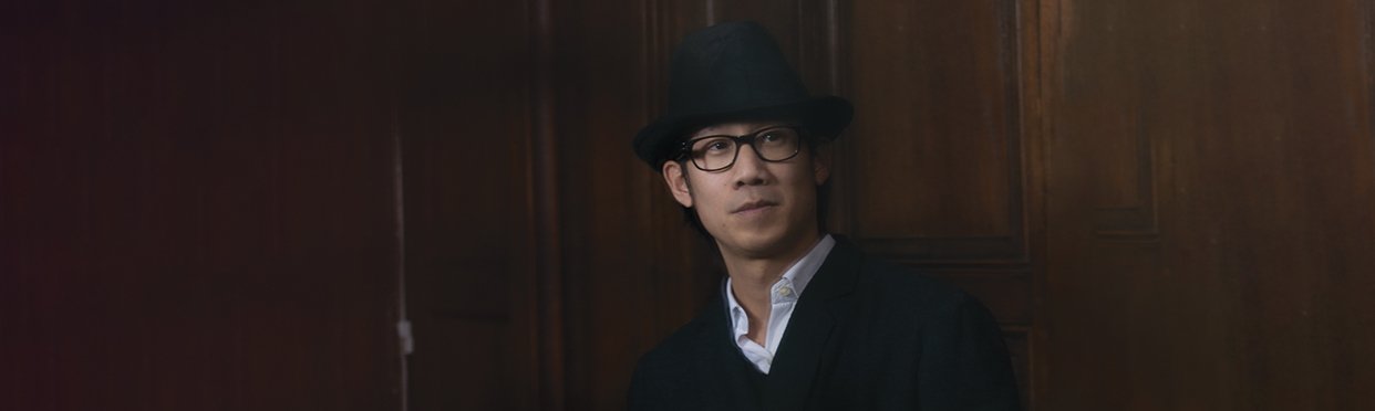
Khoa Dodinh, Hennessy’s Artistic Director, is responsible for the renowned brand’s Image, Design and Architecture on a worldwide scale. His creative helmsmanship has breathed life into a world subtly infused with luxury, tradition and state-of-the-artness.

Re-adorning cognac with its olfactory generosity, epitomizing its amber-orange glints through shapes and materials, visually expressing the promise of its gustatory pleasure is an art in which Khoa Dodinh excels. His insightful artistic collaborations and his team-based visionary projects have placed Hennessy on a par with leading brands and whose launches are eagerly awaited. Encounter.

HEC prep classes, Business School… so, where does your artistic gift come from?

Art’s always been part of my life. It’s been my guiding principle. I was born into an artistic environment. It was perfectly natural and clear to me to create and to express myself through drawing and painting. After graduating from a top business school, I began my career in L’Oréal Luxe which actually created a tailormade position for me where I was able to apply my creative skills as well as my business knowledge. When I was 24, I was in charge of artistic creation for the Trophée Lancôme where I partnered directly with artists whom I chose such as Nick Knight, Inez van Lamsweerde and Vinoodh Matadin, Peter Lindberg. This one-of-a-kind experience decisively influenced my professional path and the choices I made thereafter. At L’Oréal, I learned the bases of my craft as an Artistic Director which I subsequently developed and finetuned through my professional experiences and encounters.

What are your missions as Hennessy’s Artistic Director?

As I’m in charge of Hennessy’s image and I’m the “keeper of the flame”, my role is to define its creative vision and to ensure that its various means of expression on a worldwide scale are absolutely visually coherent. More specifically, I’m responsible for the three cornerstones of Artistic Direction, i.e. Image, Design and Architecture. A 360° perspective to Artistic Direction with a significant focus on the brand’s business strategy. I also work hand-in-hand with artists around the globe, Americans, Chinese, etc. whom I seek out and select for each particular project.

Where does your inspiration come from? (your areas of interest: culture, nature, cinema, photo, sport, travel, etc.?)

When I address a creative brief, I incorporate different variables. These variables may be cultural, social, artistic and/or semiological. I organize them and illustrate them through images which spring to mind naturally. I normally formalize an idea through an image. This image is a creation of the mind but is forged through visual references related to my personal experience. I visualize the shape, the colour, the design. To use a mathematical analogy, it’s as if I’ve visualized the result of a problem posed prior to solving it. Then I exchange with my colleagues and we finetune the idea and materialize it. I cultivate and nourish this process of conceptualization in different ways, such as for example through artistic encounters, through my creative interests for contemporary painting and photography, through my travels and various readings.

You’ve won numerous prizes and awards. What’s the latest to date and for which product?

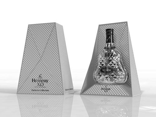
It’s mainly my colleagues who submit entries for these prizes and actually we do often win them. If I had to choose one or even several, without a doubt it would be the moment we achieved a Grand Slam in 2015 with all the biggest world competitions (Pentawards, Popai, Formes de Luxe, etc.) for our design for Hennessy’s 250th anniversary. This was a first-ever for a Luxury brand.

Do you partner with renowned creators or designers? If yes, which ones?

When I joined LVMH Group and Hennessy 10 years ago, I began initiating partnerships with artists, which was something totally unheard of before in the world of wine and spirits. Since then, the list of partnerships has constantly grown to over a hundred now. But, if I had to keep but three in the realm of design, it would be Tom Dixon, Marc Newson and Ferruccio Laviani. Tom for his creative genius and his understanding of industrial challenges, Marc for his one-of-a-kind approach to ergonomics and shape, and Ferruccio for his elegant, sensual design.

You’re in charge of brand image but do your missions go as far as packaging manufacturing?

Whenever I work on a packaging concept and design, I’m obliged to take the feasibility of its development and production into consideration. Otherwise, we’re only focusing on the artistic gesture and, as such, that’s totally illogical. So, to answer your question, packaging manufacturing is then entrusted to engineers; my role is to ensure that the design and aesthetic quality are observed and meet our requirements during the various phases of production.

In this case, are you involved in selecting suppliers?

I’m generally presented with the prototypes and suppliers’ first-of-series and, based on the result, we then choose one. These suppliers are part of a roster of service providers selected according to criteria defined by LVMH Group.

Do you make a practice of visiting workshops and shows to comprehend creation processes and opportunities?

As a matter of fact I visit a lot of artist, designer and architect studios. I believe it’s essential to meet creatives in their own workspace to fully appreciate their artistic world and their creation process. A relationship based on mutual respect is forged between us. I travel a lot for my work, mainly to Asia and the USA. During these professional trips, I set aside time to visit shows, galleries, and to meet local talents. All these visits and encounters are extremely enriching culturally, humanely and creatively. They’re sources of inspiration for me, help me grow and actually enable me to extend the sphere of possibilities from a creative and technical point of view.

Does packaging inspire the promotional campaign or is it designed based on the artistic direction you wish to impart? Could you perhaps give us an example?

Packing forms part of a whole. Yet, it’s not necessarily the determinant. It all depends on the projects and there can be exceptions. More often than not, it’s the idea, the creative concept that will set the mood, and all the building blocks of the promotional platform such as packaging, the product, the visual campaign will express it and embody it. The example of the global programme for the Chinese New Year which we launched 4 years ago describes this process clearly. We define a concept for this programme every year with the Chinese artist selected. The artist creates their work of art which is then expressed through packaging and the advertising campaign; such was the case for Chinese artist Zhang Huan in 2020.

How do you see packaging design evolving at Hennessy?

Packaging design development is top of our agenda. Packaging is the embodiment of a social, cultural and commercial brand position. This embodiment has to be the most accurate and relevant as possible.

What do you expect from suppliers as regards meeting Hennessy’s demands?

Innovation from both a technical and production-method stance is vital. Research and development of new materials, new finishes which take into account the different contextual considerations and the evolution of our societies must be a constant impetus.

Projects for end 2020 – 2021? Can we talk about them? As a general rule, we reveal artistic and design partnerships when projects are launched. So, you’ll have to be patient. We’ve got incredible projects in the pipeline right now. Incredible because they stem from special creative dialogue initiated with the greatest artists of our time. Through art, we inspirit our image and Hennessy’s history.